

Good Error Messages Are Part of Good Product Design
Errors are unavoidable in software, but confusing error messages do not have to be. A well-written error message can help users understand what went wrong, fix the problem faster, and feel more confident using a product.
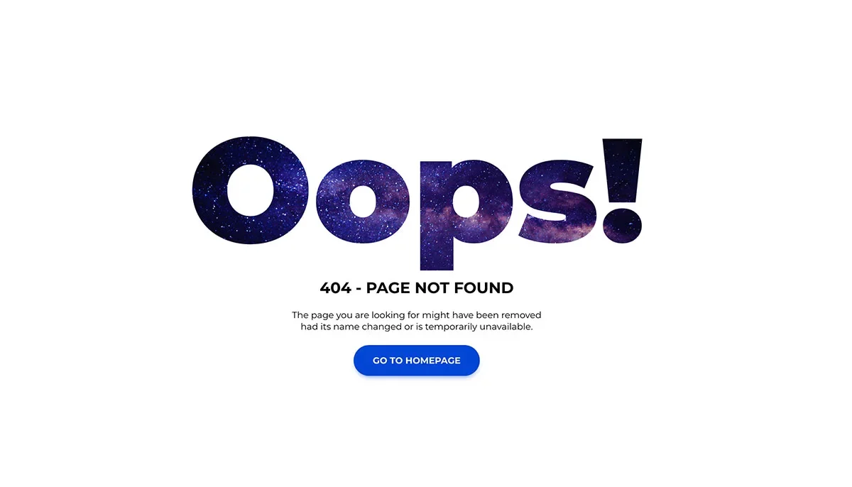
Good Error Messages Are Part of Good Product Design
Every digital product eventually encounters an error.
A form gets submitted with missing information. A file upload fails. A network connection drops. A password does not meet the required rules.
When that happens, the error message becomes part of the user experience.
It is easy to treat error messages as an afterthought, especially when the main feature is working correctly. But users often remember how an application behaves when something goes wrong just as much as they remember how smoothly it works when everything goes right.
A message like "Something went wrong" may tell the user that there is a problem, but it does not tell them what happened or what they should do next.
That is where thoughtful error handling matters.
What Makes an Error Message Useful?
A useful error message should answer three basic questions:
- What happened?
- Why did it happen?
- What can I do about it?
Consider these two examples.
Weak:
Invalid input.
Better:
Your password must contain at least eight characters, one number, and one uppercase letter.
The second message gives the user useful information immediately. They know what is wrong and what they need to change.
Error messages should be specific enough to help users recover instead of simply informing them that something failed.
Put the Error Where the Problem Happened
Imagine filling out a registration form with six different fields.
You click Create Account, and a message appears at the very top saying:
Please correct the errors below.
But none of the fields clearly indicate which one is causing the problem.
Now the user has to search for it.
A better approach is to place the relevant message close to the field that needs attention.
For example:
Please enter a valid email address.
Password
Password must contain at least eight characters.
This reduces the amount of guessing the user has to do.
It is particularly useful for:
- Registration forms
- Login pages
- Checkout forms
- Profile settings
- Search forms
- File uploads
- Payment forms
The closer the message is to the source of the problem, the easier it is to understand and fix.
Do Not Rely on Colour Alone
Red is commonly associated with errors, and there is nothing wrong with using it as part of an error state.
The problem comes when colour becomes the only way the interface communicates what happened.
For example, changing an input border from grey to red without adding any explanation does not tell the user what they need to fix.
A stronger error state can combine:
- A clear text explanation
- An appropriate icon
- A visible change to the affected field
- A descriptive label
- Proper accessibility support
This also makes the interface easier to understand for people who cannot easily distinguish certain colours.
The message should still make sense if the colour disappears.
Speak Like a Human
Developers work with technical errors every day, but most users do not need to see the same language developers see in their logs.
For example:
HTTP 500 Internal Server Error
may be useful information during debugging, but it is not necessarily useful to someone simply trying to open their dashboard.
A user-facing message could instead say:
We couldn't load your dashboard right now. Please try again in a moment.
The technical information can still be recorded in the application's logs for developers.
The important distinction is this:
Developers need diagnostic information. Users need understandable information.
The two do not have to be the same message.
Tell Users What to Do Next
An error message should not leave the user at a dead end when there is something they can do.
Depending on the situation, the next step might be:
- Try again
- Check your internet connection
- Choose another file
- Reset your password
- Return to the dashboard
- Contact support
For example, instead of:
Upload failed.
Try:
We couldn't upload this file. Check that it is under 10 MB and try again.
The second message gives the user a reasonable path forward.
However, the suggested action should also be realistic. If the problem is a temporary server failure, repeatedly telling the user to fill out the form again is unlikely to help.
Do Not Blame the User
Error messages should explain problems without making users feel like they have done something stupid.
Compare:
You entered the wrong value.
with:
Please enter a valid phone number.
The second version communicates the same basic problem without sounding accusatory.
Good error messages should be:
- Clear
- Direct
- Respectful
- Specific
- Helpful
There is no need to hide the problem. The goal is simply to explain it in a way that helps the person recover.
Error Handling Matters to Developers Too
Good error messages do not happen only at the design stage.
The application's underlying error-handling system also matters.
Different failures should be treated differently. A validation error is not the same thing as a network failure, and a temporary server problem is not the same thing as an authentication issue.
A well-designed application should consider things such as:
- Input validation
- Error logging
- Unexpected failures
- Network failures
- Authentication errors
- API failures
- Retry behaviour
- User-friendly fallback states
This benefits both users and developers.
Users get clearer feedback, while developers have better information when investigating problems.
A Simple Error Message Checklist
Before shipping a feature, take a few minutes to test its failure states.
Ask yourself:
- Is the problem clearly explained?
- Can a normal user understand the message?
- Is the message close to the source of the problem?
- Does it explain how to fix the issue?
- Does it rely on more than colour?
- Is the tone respectful?
- Is useful technical information being logged separately?
- Does the error state work properly on mobile?
- Has it been considered from an accessibility perspective?
These questions are simple, but they can expose a surprising number of usability problems.
The Details Matter
It is easy to focus on the successful path when building a product.
You design the dashboard, build the form, connect the API, polish the animations, and make everything look good when things work.
But real users will eventually encounter the other side of the experience.
A network request will fail.
Someone will enter the wrong information.
A service will temporarily go offline.
A file will be too large.
Something unexpected will happen.
That is why error states deserve the same attention as the rest of the interface.
Final Thoughts
Errors are unavoidable in software.
Confusion is not.
A good error message does more than announce that something went wrong. It helps users understand the situation, recover from it, and continue using the product without unnecessary frustration.
Good design is not only about making the successful path beautiful.
It is also about making the unsuccessful path understandable.
Sometimes, the quality of a product is revealed most clearly by how it handles failure.

24 followers
Comments0
No comments yet. Start the conversation!